Case Study
Data visualizations are the reinterpretation of facts, figures and other data that can lend itself to an overview of a topic, or feature. This is done with visuals, as creatively presented charts, graphs or other design elements. I love data, and I love visuals. Thus, data visualization is one of my favorite past-times.
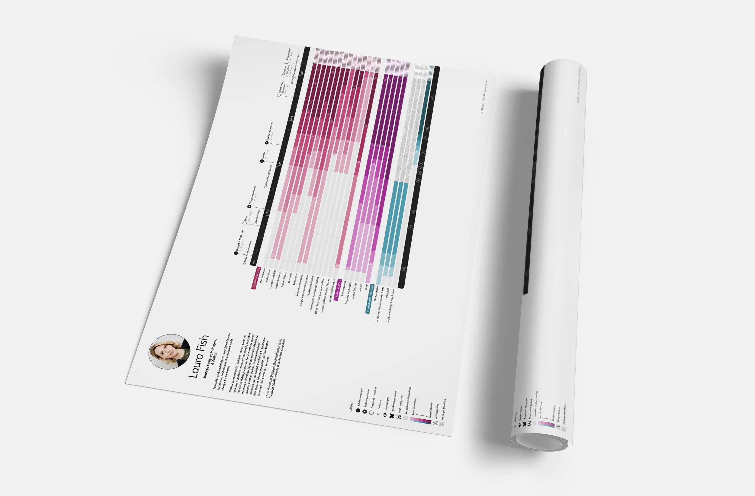
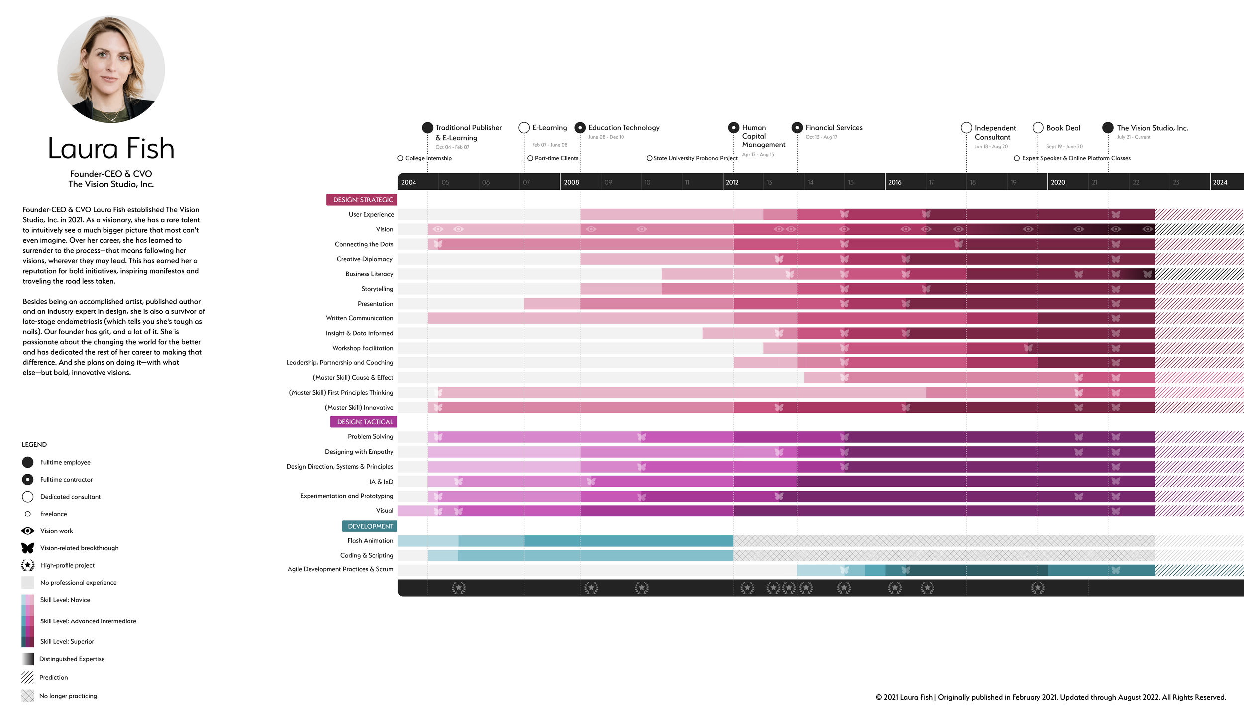
This data visualization is of my career, skills and experience. Here, I've reinterpreted how to present a career. Instead of a written resume, here I explored an exercise in visualizing a journey of hard-won professional growth and, importantly, illustrate how it all tied back to my vision endeavors.
Note: I started this effort in 2015! The process, and versions, have evolved. This version, is the current iteration.
THE APPROACH
1) The Information
As I began this effort, I started with the basics. I reminded myself of the basic types of information a resume contains (employers, dates of work, jobs, roles, skills, talents, and projects). Then I reworked a new framework. I had the benefit of recently co-authoring a book that explains how a designer transforms from tactical to strategic—so, I used that thinking as the base.
2) Connections, Relationships & Patterns
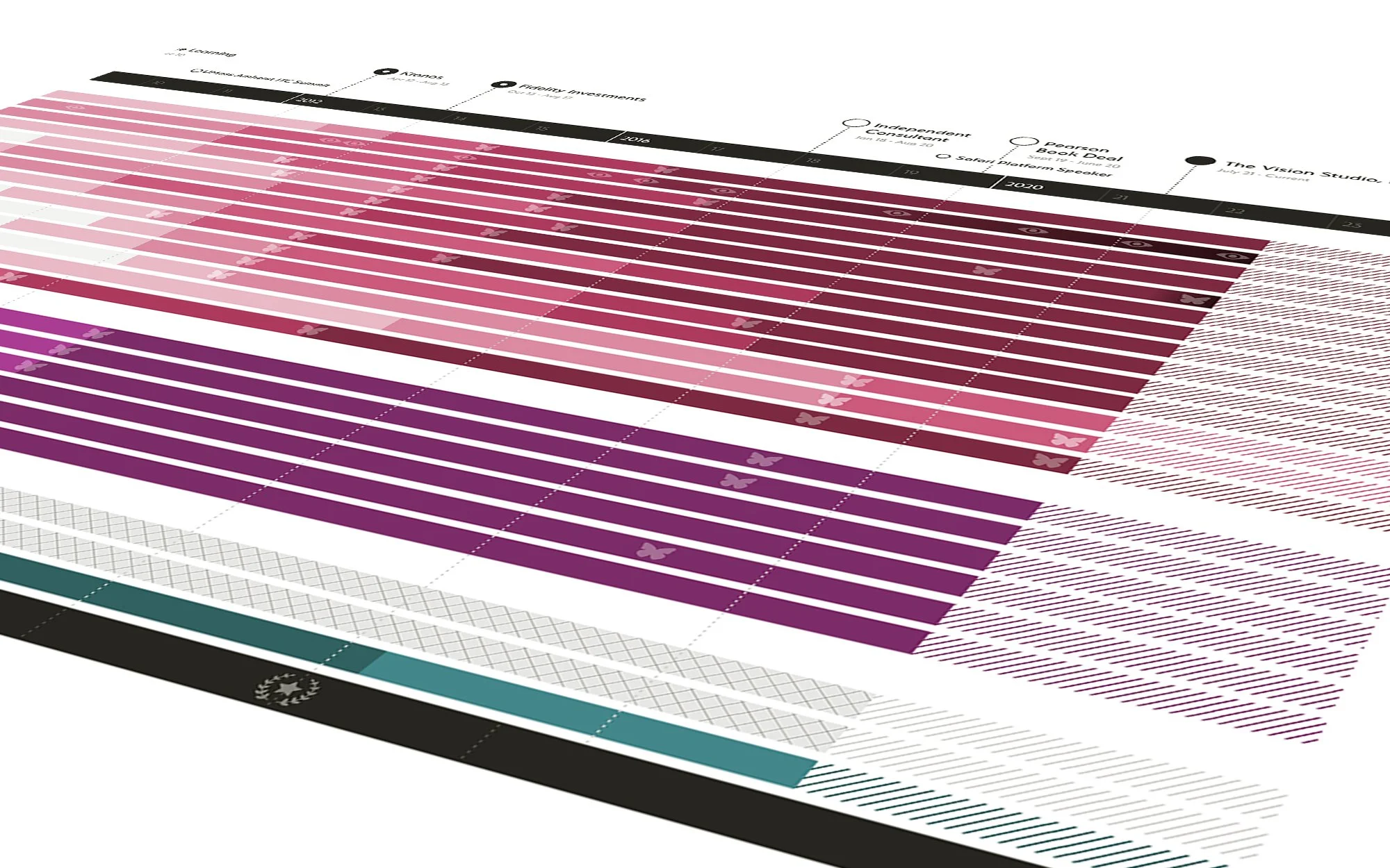
I drafted a better system. It was complicated. So I worked (and reworked) that system until it was in its simplest form, visually. Thus, it remains complex, not complicated. Notice the layers of connections, relationships and patterns. "Clean" means the core message is surfaced without clutter getting in the way… so the more elements you're working with, the more challenging clean becomes.
3) Style
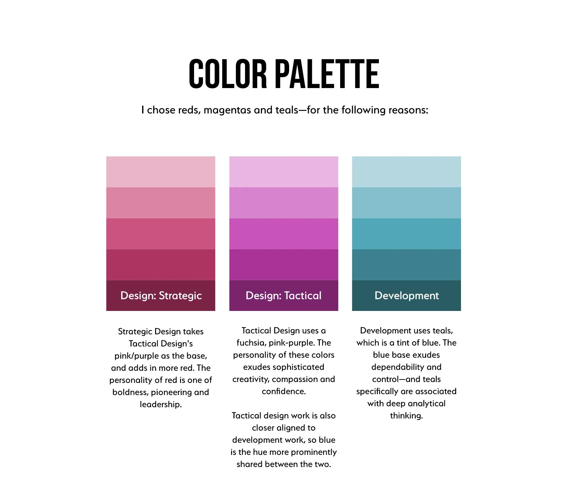
Last, but not least, I applied a modern style that captured icons, symbolism and color psychology—and also reflected, well, me.